Wednesday 8th July 2020 – Writing Task
Hello Year 4,
We are part way through the week. You are going to use your plans from yesterday to write an art critique. If you have not done the plan, look back at yesterday’s blog for writing and use questions and painting to help you write the critique.
Features you need to include in your art critique:
- use the four headings to write in paragraphs/ make sure you use the headings. LOOK, ANALYSE, INTERPRET, DECIDE
- make sure you write in first person
- use different conjunctions to join sentences (because, but, if, when)
- Try using different openers other than I. Try using fronted adverbials. For example: At the top of the painting, In the forgeound, Looking at the…,
- expanded noun phrases, be specific to describe the nouns you see.
You can handwrite, send a photo to our email or use the headings and write in the comments in full sentences.
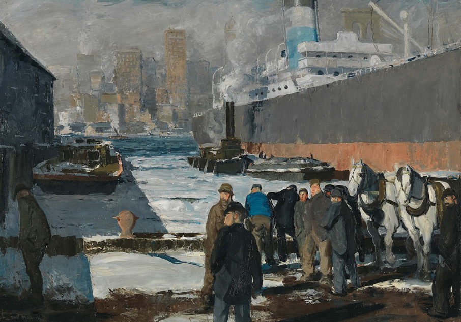
Look
I see a Giant, beautiful ship and a pair of twin, white horses. I also see a dull, smoking factory in the distance. I see a deep, blue sea but after all the weather was horrible with single coloured, grey clouds.
Analyse
The lines are perfectly used to make shapes. The shapes are brilliantly used to make objects (e.g.
the ship). The textures effect brings us into the painting and making us know what the object is made out of. My eyes goes to the ship next are the people then the pair of horse and the city in the back.
Interpret
In the piece of work I beleive people are going on holiday using the ship. I think that the most important part in the piece is the ship. It makes me feel like I am there.
Decide
I like that they drew the ship beautifully. The artist definitly did best the people. I dislike that the sky is colourless. I would change the sky.
Brilliant work, well done Franek.
1) Describe I can see tall building. I can see a giant ship with two white horses like snow. I could see smoke coming from the small ship. I can see the weather and it’s dull and grey. I see a deep navy blue sea. 2) Analyse The lines are made to make shapes, draw people and make ships. The shape in the picture is making objects. The textures are making me going into the painting. The texture also makes the painting realistic. 3) Interpret The painting looks like the people are going to a different country or on vacation. I could see the city very busy and the ships honking. I think the most important bit is the ship. It makes me feel there is a war. 4) Decide I dislike the first horse which is the face is up. The artist did beautiful textures and detailing the people and the horse. I would change the weather and make it sunny.
Brilliant critique Regina
Look:
I see people, a city and transportation and small boats plus inventions. The colours are red, Black, Blue, peach and grey they are the colours I can see. The shapes are ovals, cylinders and rectangles are the shapes I could work out. The scene could be in Southampton as the ship looks like the titanic which crashed into a iceberg.There is no unknown objects that I can see.
Analyse:
The lines are used to add simple shapes to object’s with strait lines and detail. The shapes fit together using lines to connect them together to do the outline. The textures are effective to make it look more lifelike then others but could use some work.MY eyes took a texture journey to explore the world of textures and found a better texture for it.
Interpret:
I see a scene like the titanic is is being boarded with passengers.It makes me feel like the titanic is leaving today like the date has gone back to 1911.The most important thing is it’s the Titanic’s First journey and the most exiting event in history.The artist painted this for the Titanic’s First journey the world was so exited for this remarkable event.The art is saying to me that I’m very important to this artist and to the world.
decide
I like this painting as they put a lot of detail on the boat .The artist did the best on the boat as it looks mostly like the titanic.I dislike the people as the artist could do a bit better as the shape of the head should be different and more detail.I would like to change the people as the don’t look as lifelike as the rest and the texture could be changed.
Fantastic critique Owen! Excellent
thank you
1. Describe
I can see some men ,some stairs and some ships. The colours which i see is brown, black, white, yellow and blue. The scene is in new york and some people are chatting and ships are taking of. There are no unknown objects
2. Analyse
Lines are used to draw people and make people and ships. Shapes are working to summon the picture itself. The textures very affective because it is making the drawing more realistic. I move my eyes starting in then slowly moving.
3. Interpret
I see lots of people a few ships and a lot of skyscrapers. It makes me feel normal. The building is the most important part of the work. The artist created the piece because he wanted to.
4.decide
I like everything about the piece. The artist did the buildings the best. I dislike the horses face. I would improve the horses face if i was him.
Some brilliant sentences Talal, well done.
Look
I see big and small boats. I also see tall white proud horses and men, huge buildings and a huge cruise ship dropping off people or collecting them.
Analyse
I see bumpy lines for the clouds and straight ones for the buildings. Curved lines to make the waves. The texture makes the waves and the waves come to life and without it it would be a painting not coming to life.
Interpret.
I see people waiting for supplies or getting ready to go in a ship and go somewhere. Also boats pulling in going out to get stuff or dropping it off. A very busy city in the back ground and I can hear boats honking and water going shhhhhhhh shhhhhhhh.
Decide
I like how he has curved his brush in different places in the water to make the waves look real. I would change the buildings because they are plain and a bit smudged. And I feel like I am in the painting when I was writing this as it is amazing.
Well done Max, you have some brilliant sentences in here.
Observe:
Looking at this painting, I can see massive boats, chatty people, grey smog, white horses, chimneys and some tall building at the background.
The colours used are black, grey, white, blue and brown. Shades are grey, dark and light, some brown shading and a little bit of black has been used.
The shapes I can see are rectangles for the building at the back, circles for round faces, dome squares on the boat on the left and couple of triangles below the black chimney.
The scene is at the docks, outside, near the sea. Moreover, the people on the painting are chatting, maybe working. Furthermore, I believe this city looks quite moody and industrial.
The only unknown object is the round docking thing.
Analyse:
The lines are wiggly, not very straight, the painting was probably done quite quickly to capture the moment.
The shapes create a nice, lively scene. They do not interfere with each other. The shapes are much cleaner at the front of the picture, where people are standing and blurred in the background, especially where the buildings are.
The textures bring attention to the horses and snow where the men are standing. Also the light used to lighten up the large boat.
My eye journey starts from the large boat, then my eyes move to the people and horses, then snow, waves and water, at the end the buildings at the back. I would definitely say, there is a lot to look at.
Interpret:
I can see a lively scene, plenty of men being busy, probably talking about the ship being loaded with cargo. The 5 men are looking in the same direction and it makes you wonder, what’s over there. For me the most important part of the painting is the gigantic ship, as it’s just huge, you cannot miss it. The artist created this piece to capture the moment at the docks and some hardworking people and horses.
The art is not clear to me, there is a lot of smoke, maybe this is at the times of World War II, or not long after.
Decide:
For me this painting is very interesting. What I like a lot about this art, is mostly the ship and the water portrayed.
I really think the artist did the best is to paint the people and horses and made the painting interesting, as there is a lot to look at.
However, I dislike the smoke in the painting, as it’s not good for the environment. It spoils the atmosphere of the whole situation of being outside. But if, the painter would add brighter colours and maybe some trees in the background, I would prefer it more.
If I were the artist, I would get rid off the smoke and make the ship even longer. Overall, I enjoyed looking at this painting, because of all of the details included.
Brilliant work. You have thought really hard about each section.
The author of the piece of art painted very realistic picture of one day in a harbour. He used dark shades of black, brown and grey. He used white colour as a contrast. Triangles and squares shapes are mostly use in this picture. In the front of the picture I can see a group of men and two horses. In the middle of the picture there are a few ships including a big passenger ship. At the back there are some buildings. I guess it is a big town. It seems the author was fascinated with what he saw. It makes me curious about the place. However, I do not like the colours he used it makes the picture too sad. If I was the author of this picture, I would like to use more bright colours.
Thank you Damian, please use headings to help organise your critique.
Describe
I can see very big boats, tall people, White cold snow. The artist used grey, white, light blue and nice skin peachy colors. The visible shapes in the art piece I can see are square, cylinder, curves and more. The scene might be taken at this big lake where big boats are swimming but they can’t because the water is just filled with snow, ice because of the cold.
Annalise
The lines in the art piece are wonky, wiggly, flat, curvy and wavy like beautiful blue waves on the sea. First my eye goes from the sides to the middle. Firstly, I looked at this picture ,then I looked at the crowd of people and then I looked at the big boats. The beautiful art says to me “am I beautiful? Will you buy me?”
Interpret
While I was looking at the painting, I saw two people on horses. The drawing makes me calm. It makes me calm because when your doing art you have to be calm or you will do something wrong. The most important part of the painting is the sides and the middle. The artist made this beautiful drawing because he might of wanted a job and earn money.
Decide
I like this painting, because I like how they did the shading on the sky and everything else. The artist drew the boat on the right the best. For me I dislike nothing in the painting. If I was the artist I would change nothing because I like everything in the painting.
Brilliant detailed critique Timur
DESCRIBE
The large ship was ready to leave the harbour. There are large buildings in the background. The two appealing horses were ready to use. The dull sky was really dark. Various shapes looking like square. But there is more: circle, rectangle, pyramid, cube, cone, cylinder and sphere are visible. Various colours including Red, yellow, grey, black, blue, green and brown are clearly seen. This seen took place in a big city may be somewhere in Eastern America Snow or ice in the sea is an unknown object that stays there. The place is like in the 1900’s.
ANALYSE
The texture of the lines are not just straight they also are curved since nothing can be straight by mankind but people sometimes say it is flat. They are working by moving in reality to be working as it moves the way it performs is carved into some reason. They are effective when done properly in time. First the people then the boat because on the side then the buildings at the back then the other side which is a dark house and the sea because the middle at the end which is like guarding everywhere like a zoo.
INTERPRET
The picture is telling the reader that the ship is getting aboard and leaving so the ship is packing up and waiting for everyone but when this is happening it gets difficult since there is lot of people. The ship is making me feel that there is no more space since it is really busy like empty space. The shadow is the really important part because when this is made it is showing a really good artist and telling the texture how it looks real. Because it is telling us to remember this which tells me the Titanic since there was lots of people in the town. The art telling me, “that the ship is starting to leave,” be quick as they are calling.
DECIDE
The artist that done right was that the artist has so many spaces that he/she used it for important things. By not giving up, the artist made a beautiful picture taking time but it is still perfect. If the sky was different it could have been a blue sky so it was bright and clear that could have been better. If the artist was me, I would change the sky to blue straight away.
Wow fantastic detail in your critique Hargun!